-
I've always been fascinated by the people who are able to dance while playing the violin. The musician's energy, all the skills needed... It's really beautiful to see and to ear.
I therefore decided to make an illustration out of that, just for me (and for you. and to get better. not so just for me, then... ;p). As you might guess, it took a bit of time to do it, but there it is, just finished :
It was soooo fun :D
And kinda complicated : dynamic characters (still working on the illusion of movement), bright light coming from behind them, night scene, campfire... But the more detailed, the funnier to color and to draw !
The characters and the fire are made using alcohol markers, but for the nice gradient on the back I had to use GIMP, my beloved friend <3 Then I figured ou that a fire is better with actual logs under it, so I quickly added them in digital painting. :p
Aren't they cute, looking furtively at each other while dancing ? <3
Of course, to draw all that, I needed references. First, count a dozen pictures of me standing in weird poses in front of my bathroom mirror, to have the right poses to reproduce x) But beside it, what I had in mind while drawing was a scene from a french comic, Lanfeust de Troy, where two characters scrap next to a fire. Here's a few pictures of it :


I loved the gradients on the background and the bright contrast between shadows and light on the characters, but it was sooo hard to draw, I was afraid of screwing the whole thing up between each stroke of marker ! But it turned out pretty well ;)
I'll try to make a nice backgroud on the original one (on the paper), but I don't know how to do it... I'll get back soon (in the middle of may!) with looooots of new articles when I'll (FINALLY) be on holiday !
 2 comments
-
-
-
And here are more ideas of patterns, colors and combinations to inspire you !


Well, the pictures don't have a very good definition because it is hard to take photos of hair wraps, due to the fact that the camera doesn't understand that we'd like to focus on the hair wrap rather than on the person who wears it ^^
The two in the middle are twins : they're made with the same colors. :)
 your comment
-
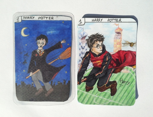
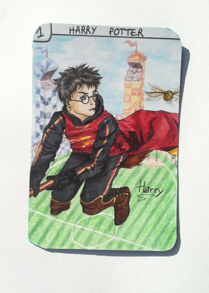
Come on, let's continue the Happy families report, since Melsaan came home a few days ago. We finished three new cards : the second version of Harry and Hermione (from the Harry potter family, thanks captain obvious), aaaaaand.... *drumrolls* Augustus Waters !
Harry is on a broomstick once again, but this time he looks older (4-5th year), and he's on a Quidditch match. For this card, I had to use a reference picture because his position was too hard to draw properly. To me, I missed his face a bit. Melsaan keeps hitting me every time I say so. Maybe I'll fix it with my graphic tab when I have the time. But anyway, we can see a clear evolution between the two cards : very detailed background, the folds in the fabric, the hair, the perspective... I'm rather proud of myself. :)
***
Melsaan have been in charge of Hermione once again. This time reading in the library, she looks very determined and Melsaan, who read the whole saga once again, insisted on her little stubborn look and on her bushy hair. Her fan art is therefore closer to the books than the movies. We can even see a SPEW pin on her chest, and SPEW is a club she creates in the third book, but which is never mentioned in the movies. Notice that the title of the book she reads, History of Hogwarts, ends in a curious mess because of lack of place to write it. ^^ I like the background she made, with his warm colors and his flying books...
***
And here's been a big challenge for Melsaan : drawing Augustus Waters. Because I missed it once before, because he had to be handsome and cute, because she had to draw his lovely crooked smile... So first, we spent about 10 minutes choosing the scene she would draw. Then, she started, helping herself with a photography from the movie. And I think it's very well done. First, the draw itself, but also the coloring part (look at this leather jacket !) and the background once again... Everything is cool and beautiful.
***
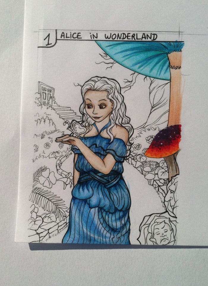
During this time, I spent a lot of time drawing and inking Alice's second version (yes, the one who keeps ending up in Wonderland). I drawed her on the same dress, but with a super cool background, and I took a small liberty : the card is entirely inspired of the Tim Burton's movies, but she is looking at a butterfly-brioche who's from the first Disney movie.
I had to thicken the character's edges a bit, so it would be detached from the background. I usually don't ink the background, but this time I felt like it would be better because I made a lot of details.
During coloring, I tried to insist on her eyes, like the makeup they made to the actress. This is where I stopped for this time. I think she looks a bit like Daeneyris, don't you ?
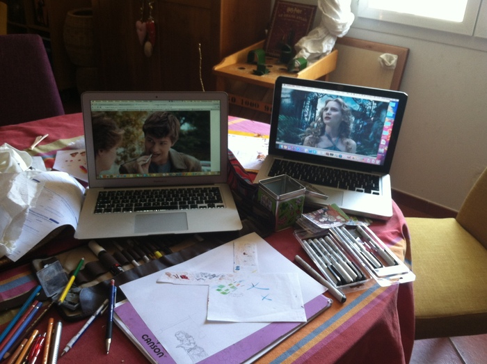
Un petit aperçu de notre plan de travail toujours aussi bordélique... Et c'est déjà la fin de cet article. Bye !
Here's a glimpse at our messy working table... And it's the end of the article already. Bye !
 2 comments
 Follow articles RSS
 Follow comments' RSS flux


